《佛教禪定實修體系》封面設計過程
2013/3/16請台中的一家印刷廠承印此書。(感謝他們幫我承印、並謝謝他們贊助我們的法務、供養上師等。)
一、封面的原始想法
Shu Zhen 於2013年3月19日下午1:12 寫道:
上師﹑通透
這本書的封面設計﹐ 不知有沒有設定好了﹖ 如果沒有設定﹐ 我想給個建議。
此是一本論及三乘一體的偉大教示佛書﹐ 說明了釋迦牟尼佛因教施材﹐ 小﹑大﹑密三乘的修行法要。我想建議的是書本就以釋迦牟尼佛身著的袈裟顏色為封面﹐ 書題用黑色﹐ 字的筆劃邊沿有細的白色﹐ 順著字的筆劃。
不知這樣還可以嗎﹖
疾呼
二、廠商的第一次設計
2013/3/21印刷廠主動幫我們設計兩種封面(如下),供我們選擇。
討論過程(中文字是弟子疾呼、通透提出,英文部分是上師的慈示)
Yutang Lin 於 2013年3月21日上午11:26 寫道:
If we are to use it,
I prefer A.
But they put two websites
on one line, that maybe not so clear to some people.
如果我們要使用它,我寧可採用A。
但是他們將兩個網站放在同一行,這樣也許對一些人來說,不是很清楚。
May all beings attain
enlightenment soon!
願一切眾生早日成佛!
Yutang
鈺堂
Tong Tou 3月 21日 寄給上師、疾呼
上師
如果選A
會請廠商修正網址
佛教瑜伽士陳健民 之後再加"祖師"兩個字。
目前就等疾呼的意見及想法了
通透百拜
Yutang Lin 於 2013年3月21 寫道:
We don’t add "祖師"兩個字 two words “founding
master” because
this book is for all Buddhists, not just for lineage disciples.
我們不加「祖師」這兩個字﹐因為這本書是給所有的佛教徒﹐而不是只給傳承的弟子們。
May all beings attain
enlightenment soon!
願一切眾生早日成佛!
Yutang
鈺堂
疾呼於2013年3月21寄給 上師、通透
兩者都有其獨特之處﹐ 有其風味。
A是帶有禪味﹐ 所採用的字體也相當藝術化。
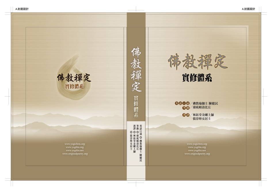
B的封面顏色予人很柔順之感﹐ 看起來很舒服。採用字體中規中矩﹐﹐ 有嚴謹感覺。(此封面顏色﹐ 字體﹐ 字邊加細白色﹐ 排法﹐ 字體在圓圈裡﹐ 表三乘佛法之圓融性﹐ 我當時也這麼構思過。)
如果選擇A﹐ 封底的“佛教禪定”四字的底圖(看不出是什麼圖樣)
It is a circle drew by a
brush—chan school often use a circle to represent the oneness of all.
它是一個以毛筆書寫的圓圈──禪宗通常以此表示一切一體。
是否能改為我們的法脈標誌圖﹐ 但標誌圖不要太清晰的那種﹐ 顏色較淡的﹐ 帶有若隱若現之感。為配合封面色彩﹐ 此標誌圖建議不採用我們設計的顏色﹐ 用單色﹐ 能配合封面顏色的單色。
No need to link our lineage to
this book; the book is beyond our lineage.
不需聯結我們的傳承標誌到這本書,這本書超出我們的傳承。
A或B﹐ 都可以﹐ 都好。我提出了自己看下去A與B給予的感覺﹐ 那麼﹐ 最後的選擇決定就由上師吧。
B looks nice but too 嚴謹(stern). The ultimate meditation
should be natural, hence I prefer the A style of gentle landscape.
B看起來不錯但太嚴謹,究竟的禪應當是自然的,因此對於A的溫和山水風味我較喜歡。
Use A as it is, but fix the
website addresses problem.
使用A(它原來的樣貌),但是修訂網址的問題。
Yen-shiou Yang 於 2013年3月21日下午1:47 寫道:
上師
依慈示辦理。
想不到封面的學問如此的大。
真是禪味十足。
上師考慮的是內涵,弟子考慮的是美觀,
真是"慚"味十足!!
通透百拜
上師3月22日寄給 疾呼、 通透
禪 (Chan) is Chinese translation of dhyana, and which means 正定(Right Concentration) or 禪定(Meditation). But in Chinese 禪 (Chan) is
also the ultimate enlightenment sense of meditation.
So with this word on the cover,
actually, to people who knows both senses of this word, there is no problem of
leading to only one side, but subtly conveys both meanings.
禪是(梵文)dhyana 的中譯,其意是正定或禪定。但在中文裡「禪」指的也是禪定之究竟證悟。
所以在封面上有此字,其實,對知道此字的兩個意義的那些人來說,是不會有引至只有一邊的問題,反而巧妙地傳達了兩個含義。
May all beings attain
enlightenment soon!
願一切眾生早日成佛!
Yutang
鈺堂
通透3月22日寄給上師、疾呼
感謝上師慈示。
有需要把封面的開示上網供眾嗎??
祈師慈示。
通透百拜
上師3月22日寄給 疾呼、 通透
If you feel it beneficial, that
is good.
如果你覺得它是有利益的,這是好事。
One point of Ji Hu’s suggestion
is that the cover might be misleading to some people. So, to reduce the
strong flavor of a Chan book, we will remove the two large禪(Chan) words in calligraphy on the bookcovers.
疾呼建議的一個要點是說,對一些人來說,此封面可能產生誤導。所以,為了減少這是一本禪書的強烈味道,在封面上我們將刪除以毛筆書寫的兩個大「禪」字。
Please ask Ms. Xie to do this,
and then show us the result.
請謝小姐這麼做,然後讓我們看其結果。
Also, the circle done by brush,
maybe it is better to replace it with the circle representing Bodhicitta and
boundless oneness that I did with brush on the back of the book, 無限的智悲 (Wisdom and Compassion in Limitless-oneness)。
還有,以毛筆畫成的圓圈,也許用我在《無限的智悲》這本書的封底以毛筆所畫,代表菩提心和無限一體的圓圈,會較為適當。
May all beings attain
enlightenment soon!
願一切眾生早日成佛!
Yutang
鈺堂
請廠商修改
通透3月22日寄給基盛印刷廖小姐 張小姐
我們上師提出了修改的需求如附檔。
就是兩個大"禪"要移除
封底的毛筆圓圈改成"菩提心"的樣式(如下圖)
菩提心的樣式,您可依照目前毛筆圓圈的毛筆書寫感覺,
來套上去。
謝謝!
三、廠商第二次設計
上師指示
Yutaing Lin 3月22 寄給通透、疾呼
It would be better if they use
only my original calligraphy of the Bodhicitta without adding the outer layers.
The outer layer they added does
not even follow my line of movement.
假如他們只使用我最原始的菩提心書法,而不加上外層,會更好。
他們加上的外層甚至沒有依循我的筆勢。
The rest seem fine.
其它的看來可以。
May all beings attain
enlightenment soon!
願一切眾生早日成佛!
Yutang
鈺堂
四、廠商第三次設計(定稿)